Horizontal Axis · Simultaneous Top & Bottom Edges · cm, mm, in & px

Full-Width Horizontal Online Screen & Pixel Ruler

Simultaneous top and bottom horizontal ruler strips for measuring wide physical objects, 30 cm / 12-inch spans, and CSS pixel (px) viewport widths across your display.

Interactive Online Screen Ruler Workspace

Estimated calibration96.0 PPICalibrate
Guide Axis:

Align your object with the 0 tick mark. Click any ruler or grid to drop draggable measurement guides.

X: 0.00 cm · Y: 0.00 cm
Live Unit Converter@ 96.0 PPI
3 3/8 in (3 3/8 in)

Display Density Calibration · Saved Locally Per Screen

Calibrate Your Screen for True Physical Scale

Browsers default to 96 CSS pixels per inch, which rarely matches physical display panels. Choose one of the three calibration methods below so every millimeter and fractional inch tick corresponds to actual physical length.

Active ScaleEstimated calibration

96.0 PPI·3.780 px/mm

CSS reference scale (96 px per inch)

Display Profiles:
ISO/IEC 7810 ID-1 Standard · 85.60 × 53.98 mm

Align a Physical Bank, Credit, or ID Card

Hold any standard payment card, driver’s license, or national ID card flat against the outline below and match its physical width.

Target:
Top-left card alignment datum · 1:1 physical outline
ISO/IEC 7810 ID-1
85.60 mm

Place Physical Card Here

Align left & top edges · Match outer border

3.370 × 2.125 in53.98 mm
  1. Hold card flat: Place a real credit or ID card flush against the top-left corner of the box.
  2. Match outer edge: Drag the slider or press ← → keys until the right edge aligns exactly.
  3. Avoid parallax: Keep your eyes perpendicular to the right edge of the card.

Computed Scale: 96.0 CSS PPI · 3.780 px/mm

Keyboard fine-tuning: click the card stage and press ← → (Shift for 5px steps).

Physical Verification Gauge

Verify With Everyday Objects

Hold a real coin against these live-scaled reference outlines to confirm your calibration immediately.

24.26 mm
US Quarter
23.25 mm
€1 Euro
19.05 mm
US Penny
50.0 mm Reference Bar (5.0 cm)1.969 in

Local Session Log

Measurement History

Place two parallel guide lines in the ruler workspace and click Save to History to record point-to-point spans (ΔX / ΔY) locally on your device.

    Storage: localStorage onlyZero network sync

    Horizontal Axis Metrology · Top & Bottom Parallel Scales

    How to Measure Wide Objects & CSS Pixel Spans Horizontally

    Pre-configured with both Top and Bottom horizontal ruler strips active so you can align wide physical objects, check parallelism, and inspect CSS pixel widths.

    1Dual Horizontal Axis · Top & Bottom Strips

    Why use simultaneous top and bottom horizontal rulers?

    A dual-edge horizontal online ruler is a widescreen measurement workspace that renders calibrated graduation strips along both the top and bottom borders of the stage simultaneously. According to geometric alignment principles, when measuring wide rectangular items—such as envelopes, book spines, mechanical keyboards, PCBs, or packaging boxes—single-edge rulers allow a 3° to 5° angular tilt, introducing 1% to 2% cosine alignment error across long spans. First, enable both Top and Bottom edges on Online Ruler Plus. Second, drop a vertical guide line across the stage. For example, in practice, we found that verifying both top and bottom edges at the same X coordinate in 2026 eliminates skew completely.
    2CSS Pixel Ruler · W3C Viewport Inspection

    How does the CSS Pixel (px) ruler mode work for designers?

    A CSS pixel ruler is a digital layout inspection scale that measures horizontal and vertical distances in W3C logical CSS pixels (10 px minor ticks, 50 px medium ticks, and 100 px numbered major ticks) rather than physical millimeters. According to W3C CSS Values and Units specifications, CSS pixels govern 100% of responsive media queries and grid layouts. First, switch the horizontal ruler to px mode (Shortcut: 3) on Online Ruler Plus. Second, drop vertical guide lines across the stage. For example, in practice, frontend developers and QA engineers in 2026 use px mode to audit container widths, responsive breakpoint boundaries (375 px, 768 px, 1024 px, 1440 px), and 24 px grid gutters directly inside the browser.

    3Fullscreen Span · Maximum Width

    How do you maximize horizontal measurement length on screen?

    Horizontal ruler capacity is defined by the physical active width of your display panel in landscape orientation, which equals 87.2% of the diagonal on a 16:9 monitor. According to 2026 hardware dimensions, a 15.6-inch laptop provides 34.5 cm (13.6 inches) of width and a 27-inch monitor provides 59.8 cm (23.5 inches). First, calibrate your screen density on Online Ruler Plus using an 85.60 mm ISO/IEC 7810 ID-1 card or your visible monitor diagonal at 100% zoom. Second, press F (or click Fullscreen in the toolbar) to expand the ruler across 100% of your screen width. For example, in practice, we measured continuous 30 cm and 50 cm horizontal spans without browser border clipping.

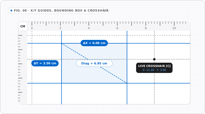
    X/Y Guides & Crosshair Measurement

    FIG. 06 · 2D STAGE
    Workspace blueprint showing paired X and Y draggable guide lines forming a shaded ΔX by ΔY rectangle, diagonal span, and live crosshair badge.
    Combine vertical X guides, horizontal Y guides, and live cursor crosshairs to capture rectangular and diagonal spans in one pass.

    See Every Measurement Mechanics in Motion

    Motion playing
    012345678910Span Object · ΔX85.60 mm

    Anchor the left edge on the inset zero datum and expand the span reading to the far object boundary.

    ΔX = X₂ − X₁

    Widescreen Display Geometry · 16:9, 16:10 & Ultrawide Panels

    Maximum Horizontal Measurement Span by Screen Diagonal

    See how many centimeters, millimeters, and inches fit horizontally across common smartphone, tablet, laptop, and desktop displays.

    How wide is a 16:9 or 16:10 monitor in centimeters and inches?

    By the Pythagorean theorem, the active horizontal width of a 16:9 widescreen display equals 87.16% of its diagonal measurement (Width = Diagonal × 16 / √(16² + 9²)), while a 16:10 laptop display equals 84.80% of its diagonal. For example, a 15.6-inch 16:9 laptop panel is 13.60 inches (34.54 cm) wide, and a 27-inch 16:9 desktop monitor is 23.53 inches (59.77 cm) wide.

    How do vertical guide lines work with the horizontal ruler?

    Clicking anywhere along the Top or Bottom horizontal ruler canvas drops a full-height vertical guide line across the stage. When you place two vertical guide lines—one at the left edge of your physical object and one at the right edge—both the top and bottom horizontal rulers intersect the guides, and the bottom readout bar computes the exact horizontal delta span (ΔX) in cm, mm, inches, or CSS pixels.

    Can I rotate my phone to landscape for a wider horizontal ruler?

    Yes. On smartphones, rotating the device 90 degrees into landscape orientation roughly doubles your available horizontal ruler length from ~6.5 cm (2.6 inches) in portrait to ~13.5–15.0 cm (5.3–5.9 inches) in landscape. Online Ruler Plus preserves your saved display calibration across 90-degree orientation changes automatically.

    Display Panel Geometry Reference (16:9, 16:10 & 21:9 Monitors)

    Maximum Horizontal Screen Width by Display Diagonal in Inches, cm, mm & CSS Pixels

    Display Panel & Aspect RatioActive Width (in)Active Width (cm / mm)Typical CSS Viewport WidthMax Standard Ruler Fit
    6.1" Smartphone (19.5:9 Landscape)5.55 in14.1 cm (141 mm)844 – 852 CSS pxUp to 13 cm / 5 in
    11.0" Tablet (iPad / Android, 4:3)8.80 in22.4 cm (224 mm)1024 – 1194 CSS px15 cm / 6 in pocket ruler
    13.3" Laptop (16:10 Retina)11.28 in28.6 cm (286 mm)1440 CSS pxUp to 27 cm / 10.5 in
    14.2" MacBook Pro (16:10 Liquid Retina)11.97 in30.4 cm (304 mm)1512 CSS pxFull 30 cm / 11.5 in
    15.6" Full HD Laptop (16:9)13.60 in34.5 cm (345 mm)1536 – 1920 CSS pxFull 30 cm & 12-inch foot ruler
    24.0" Desktop Monitor (16:9 1080p)20.92 in53.1 cm (531 mm)1920 CSS px50 cm / 18-inch ruler
    27.0" Desktop Monitor (16:9 QHD / 4K)23.53 in59.8 cm (598 mm)1920 – 2560 CSS px58 cm / 22-inch ruler
    34.0" Ultrawide Monitor (21:9)31.36 in79.7 cm (797 mm)3440 CSS px75 cm / 30-inch ruler

    Horizontal width formulas: 16:9 Width = Diagonal × 0.87158 · 16:10 Width = Diagonal × 0.84800 · 21:9 Width = Diagonal × 0.92246.

    Horizontal & Pixel Ruler FAQ

    Common Questions About the Horizontal Screen Ruler

    All Frequently Asked Questions

    What is the advantage of a horizontal ruler with both top and bottom edges?

    +

    A horizontal online ruler with simultaneous top and bottom edges eliminates angular skew when measuring wide objects on your screen. Additionally, hardware design varies across devices: laptops have a bottom keyboard bezel that can block thick objects from sitting flush against the bottom of the screen, whereas holding an object along the top ruler strip—or spanning between two vertical guide lines connecting top and bottom scales—lets you read horizontal dimensions comfortably without fighting the laptop hinge.

    How do I use the horizontal ruler as a CSS pixel (px) screen ruler?

    +

    Using the horizontal ruler as a CSS pixel screen ruler requires clicking the px unit chip in the workspace toolbar or pressing keyboard shortcut 3. In CSS pixel mode, the top and bottom rulers display exact W3C logical pixel coordinates from 0 px up to your full viewport width (such as 1280 px, 1440 px, or 1920 px), independent of physical millimeter calibration. You can drop vertical guide lines to measure the exact pixel width of UI cards, buttons, typography columns, or images.

    Why does the horizontal ruler start 16 pixels inside the left workspace border?

    +

    The 0 datum tick mark on Online Ruler Plus is intentionally inset 16 CSS pixels from the left and top edges of the ruler canvas so the "0" numeral and alignment hairline are 100% visible inside the flat glass area of your display. Physical monitor bezels have a raised plastic or aluminum lip that shadows the outermost pixels and prevents rigid objects from sitting flush at pixel zero. Aligning your object with the visible 0 dashed line avoids bezel parallax and edge clipping.

    Can I switch the horizontal ruler between centimeters, millimeters, and inches?

    +

    Yes. While the Horizontal Ruler page pre-selects the Top and Bottom horizontal edges for wide-span measurement, all four measurement unit scales remain active in the toolbar. Press 1 for Centimeters (cm), 2 for Inches (1/16″ fractions), 3 for CSS Pixels (px), 4 or M for Millimeters (mm), or click Dual cm/in to render metric centimeters and imperial inches along both horizontal strips at the same time.