Quick Answer
Web browsers hardcode the CSS inch (1in) as exactly 96 CSS pixels for predictable web layout, ignoring the true physical density (PPI) and OS display scaling of your monitor or phone. Without calibrating against a real reference object, an online ruler can easily read 10% to 35% off.
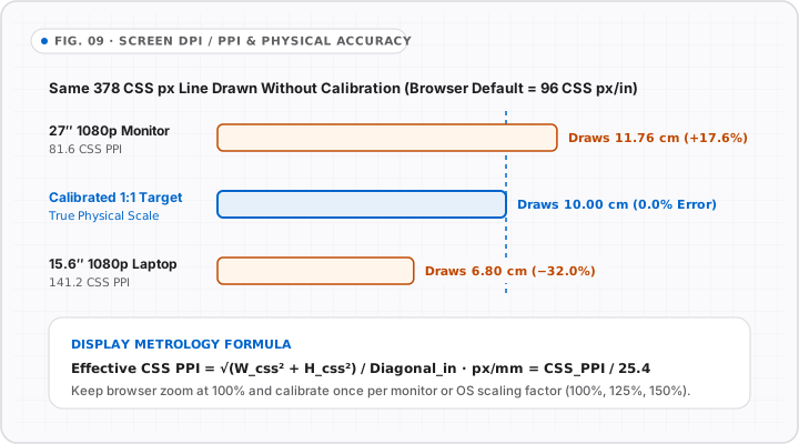
Open two laptops side by side—say, a 27-inch desktop monitor (1920 × 1080) and a 14-inch MacBook Pro—and ask a basic uncalibrated browser script to draw a 1in CSS box. On the 27-inch screen, that box measures roughly 1.18 real inches. On a high-density display with Windows 125% scaling, it might measure 0.88 inches.
That discrepancy is not a browser bug. It is built directly into the W3C CSS specification. Understanding why lets you calibrate any accurate online ruler in ten seconds and recognize misleading “zero-calibration” promises across the web.
What 1in = 96px Actually Means in Browsers
Under the W3C CSS specification, absolute length units (in, cm, mm, px) have fixed mathematical ratios to one another, NOT fixed physical sizes on unknown hardware:
1inin CSS always equals96 CSS pixels1cmin CSS always equals96 / 2.54 ≈ 37.795 CSS pixels1mmin CSS always equals~3.78 CSS pixels
Meanwhile, your operating system maps CSS pixels onto physical panel pixels using display scaling (devicePixelRatio, 100%, 125%, 150%, Retina 2x).
Why Real Displays Rarely Equal 96 Effective PPI
| Display Example | Resolution & Scaling | Effective CSS PPI (Approx.) | Error at CSS 96 PPI Default |
|---|---|---|---|
| 27” 1080p Monitor (100% scale) | 1920×1080 at 100% |
~81.6 PPI |
Reads ~17.7% too large |
| 24” 1080p Monitor (100% scale) | 1920×1080 at 100% |
~91.8 PPI |
Reads ~4.6% too large |
| 27” 4K Monitor (150% Windows scale) | 3840×2160 at 150% |
~108.8 PPI |
Reads ~11.8% too small |
| 13.3” 2560×1600 Laptop (Retina 2x) | Effective 1280×800 CSS |
~113.5 PPI |
Reads ~15.4% too small |
| Modern Smartphone (e.g. 6.1” OLED) | Varied logical CSS width | ~145–165 CSS PPI |
Reads ~35–42% too small |
Look closely at the bottom row: on almost every smartphone, an uncalibrated 96 PPI web ruler shows 1 inch as barely 15 mm!
Why Browsers Cannot Auto-Detect True Physical Scale
Modern browsers intentionally withhold exact monitor physical width/height in millimeters (EDID hardware metrics) from web pages so advertisers cannot silently fingerprint your exact laptop or monitor model. That privacy protection is good for users—and it is why user-assisted calibration is the only honest way to build an online ruler to scale.
Two Reliable Ways to Calibrate OnlineRulerPlus
- Credit Card / ID-1 Calibration (Recommended): Hold any bank, credit, debit, or national ID card (
85.60 mmwide) on the OnlineRulerPlus calibration strip and slide until the edge lines match. One setting calibrates inches, cm, mm, and XY guides across the entire site. - Monitor Diagonal + Resolution: Enter your known monitor size (e.g.,
24",27",15.6") and pixel resolution when no physical card is handy.
Also check how Windows and macOS display zoom interact with browser zoom in our dedicated guide: Windows & macOS Display Scaling: Why Your Screen Ruler Changes Size.
Interactive Tools on OnlineRulerPlus
Try It in the Calibrated Workspace
Questions & Answers
Frequently Asked Questions
Why doesn't Chrome or Safari just read my monitor's exact physical size automatically?
+
For privacy and browser fingerprinting prevention, web APIs deliberately hide exact hardware model names and physical panel dimensions in millimeters from websites. Browsers expose CSS pixel size and devicePixelRatio—not true physical inches per pixel.
If a website claims 'No Calibration Needed — 100% Accurate Online Ruler', is that true?
+
No. Any webpage claiming automatic 100% physical accuracy across unknown monitors without user input is simply assuming default CSS 96 PPI or guessing from typical screen presets. Always verify once against a physical ID-1 card or ruler before trusting tight tolerances.
What is the difference between DPI and PPI on a screen ruler?
+
PPI (pixels per inch) measures the density of physical pixels on your LCD or OLED panel, while DPI (dots per inch) historically describes printer ink dots. On monitors, the value that scales an online ruler is effective CSS pixels per real physical inch.
Standards & Verified Sources
- W3C CSS Values and Units Module Level 3 — Absolute Lengths — Specifies that 1in in CSS is anchored to 96px rather than guaranteed physical surface inches.
- MDN Web Docs — window.devicePixelRatio — Documents CSS pixel to physical pixel ratio without exposing true hardware panel size.