Quick Answer
Windows display scaling (125%, 150%), macOS Retina 'More Space' settings, and browser page zoom all multiply the size of a CSS pixel relative to your physical monitor pixels. Keeping browser zoom at 100% and recalibrating whenever switching monitors guarantees repeatable actual-size readings.
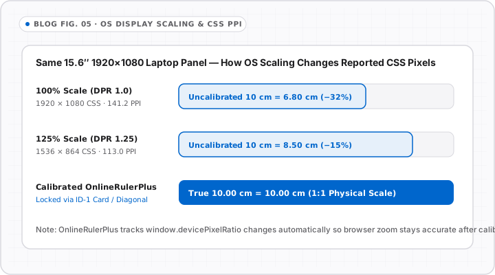
Maybe you calibrated an actual size online ruler cleanly last week—and today it suddenly reads 20% smaller or larger. In almost every case, either your browser zoom changed, Windows applied an automatic scale factor (125% or 150%), or you dragged the browser window onto an external monitor.
Here is the three-layer stack between our canvas code and your monitor glass, and how to keep all three steady.
The Three Layers That Control On-Screen Scale
Every browser ruler passes through three multipliers before hitting your eyes:
- Physical Panel PPI: Fixed by hardware (for example,
~109 PPIon a27" 2560×1440monitor or254 PPIon a MacBook Pro14"Liquid Retina display). - OS Display Scaling: Windows Settings > System > Display > Scale (
100%,125%,150%) or macOS System Settings > Displays (Default vs. More Space). - Browser Page Zoom: Chrome, Edge, Safari, or Firefox per-site zoom (
90%,100%,110%,125%), often tripped accidentally viaCtrl + Scrollor trackpad pinch.
How Each Setting Shifts an Uncalibrated Ruler
| Condition Change | What Happens to Uncalibrated 1 inch |
Fix |
|---|---|---|
Windows Scale raised 100% -> 150% |
Expands by +50% physically on screen | Keep new OS scale, run 10s Calibration |
| macOS switched from Default to More Space | Shrinks physically (~10–15% smaller) | Recalibrate once for your daily macOS preset |
Browser zoom nudged to 125% |
Stretches calibrated scale by +25% | Press Ctrl+0 (Win) or Cmd+0 (Mac) to restore 100% |
| Moving tab from 14” laptop to 27” monitor | Different native PPI + scaling ratio | Recalibrate for whichever display sits in front of you |
Best-Practice Checklist for Dual-Monitor Desks
- Pick one primary measuring screen: Keep calibration matched to the monitor you sit closest to—usually your main desk monitor or laptop screen.
- Keep browser zoom pinned at
100%: If text on sites looks small, adjust Windows/macOS OS scaling once and calibrate OnlineRulerPlus to that permanent OS baseline rather than constantly changing browser zoom per site. - Disable pinch-zoom accidents: On Windows Precision Touchpads and Mac trackpads, wait a split second after zooming inside canvas tools so you scale the canvas controls cleanly rather than zooming the whole webpage DOM.
Ready to lock your screen right now? Follow How to Calibrate an Online Ruler Using a Credit Card or go straight to the Calibration Guide.
Interactive Tools on OnlineRulerPlus
Try It in the Calibrated Workspace
Questions & Answers
Frequently Asked Questions
Does browser zoom (Ctrl + / Cmd +) break online ruler calibration?
+
Yes. Changing browser zoom scales the entire webpage canvas proportionally—zooming to 110% stretches a previously calibrated 1-inch span to 1.10 physical inches. Always reset browser zoom to 100% (Ctrl+0 on Windows, Cmd+0 on Mac) before calibrating or measuring.
Why does my ruler read differently on my laptop screen vs. my external 27-inch monitor?
+
Two monitors almost always have different physical pixel pitch (PPI) and different OS scaling factors. Because calibration is calibrated to one physical display density, recalibrate briefly in the Calibration Guide whenever you move your browser tab onto a second display.
Do macOS 'Looks like 1440×900' vs. 'More Space' display settings change an online ruler?
+
Yes. macOS Retina scaling renders UI at a virtual logical resolution before resampling to physical panel pixels. Selecting 'More Space' packs more CSS pixels into each physical inch, shrinking uncalibrated web rulers until you calibrate for that preset.
Standards & Verified Sources
- Microsoft Learn — High DPI Desktop Application Development on Windows — Explains Windows DPI scaling percentages (100%, 125%, 150%, 200%) and logical pixels.
- MDN Web Docs — Window.devicePixelRatio — Details how browser zoom and OS HiDPI scaling alter devicePixelRatio.